Credit card on web and mobile: service design and usability
For: Kroger Credit team / 2023 / My role: Product Designer, Researcher
Quick Summary
Overview
Though it had potential, Kroger’s credit card product was struggling to meet its customer numbers. Our team used a service design approach to review the end-to-end process to create a proposal for a more visible, usable credit product.
role
Product Designer, Researcher
Responsibilities
Research, Artifact creation, Strategy, UI& Prototyping
collaborators
Design team, Business, Product Management
duration
1 year
Goals
Define a modern and strategic future state for the credit product, integrated with Kroger’s loyalty program
Create an MVP plan for a new credit product
Increase household % of credit card users
RESULTS
$100M projected 10-year ROI
10% revenue growth during this time period
110+ touch points identified
Detailed case study
Challenge
Although Kroger’s credit card (powered by US Bank) product had the potential for high revenue, its customer adoption was low. This was partly because of the poor discoverability of the web & mobile application, and generally poor user experience that felt short of customers’ expectations.
Goals of this project:
Understand the end-to-end experience of the credit card product and identify opportunities
Create strategies for increasing visibility of the credit card product
Create artifacts to document current & future customer flows and service touchpoints

Discovery
Research goals:
Understand the current end-to-end user flow of the credit card application
Identify pain points and opportunities to reduce friction in overall experience
Research activities:
Created service blueprint of applications and where they overlap with other services / systems
Created user flow and journey map of web and mobile applications
Expert interviews with key SMEs to understand the backend processes for the application
research
Gathering Insights
A brief competitive review revealed that Kroger’s credit card product was falling short of competitors’ due to poor discoverability and vague offerings.
Competitor review
We looked at several competitors’ websites and took note of how they market their credit product.

Competitor HEB had information about the credit product in a very visible part of the site.

Walmart also displays the credit product in a prominent way.

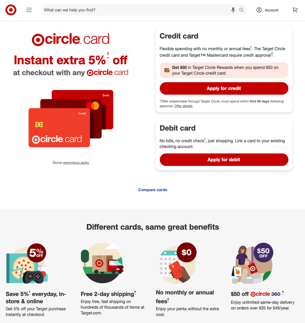
Kroger: the credit card visual is shown, but at the very bottom of the website, with poor discoverability.
Target has a very clear, easy-to-remember offering of “5%" off,” with a presence everywhere in the website.

Kroger: there is no marketing on the front page about the credit product.
Kroger was noticeably falling behind on visibility, with very minimal credit information on the retail website, when our competitors used prominent placing for theirs.
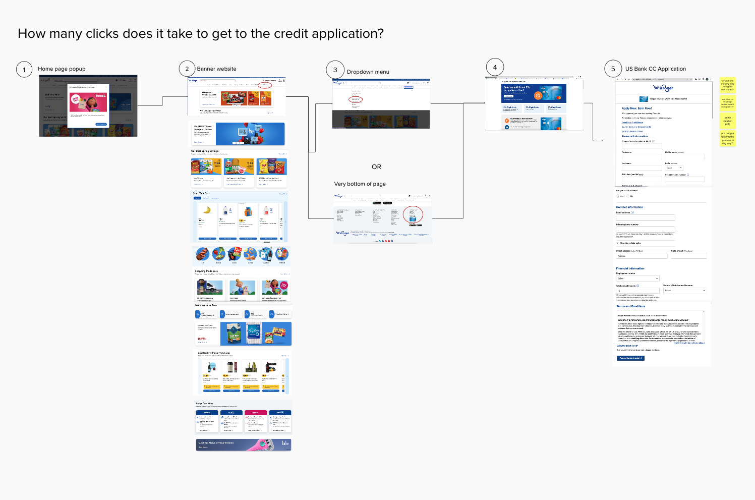
Enrollment process Review
We also reviewed how many clicks it took for a prospective customer to get to the Kroger credit application. It took 5 separate clicks, which was too many by current standards.
Emerging Themes
Here are the themes that came up in competitive research, and influenced our design choices.
Discoverability of product: Customers need clear, highly visible marketing to learn about the product. Our competitors used high-value spots on their front pages to highlight their credit offerings.
Clear, memorable offerings: Several competitors have one-liner offerings — “instant 5% off your order”, or “5% cash back.” These offers are easy to remember and consider.
Modern, trustworthy mobile experiences: There was a clear need for the mobile experience of managing the card to inspire trust and be frictionless, since customers are used to high-level technology and safety functions from bank mobile apps.
Product Strategy
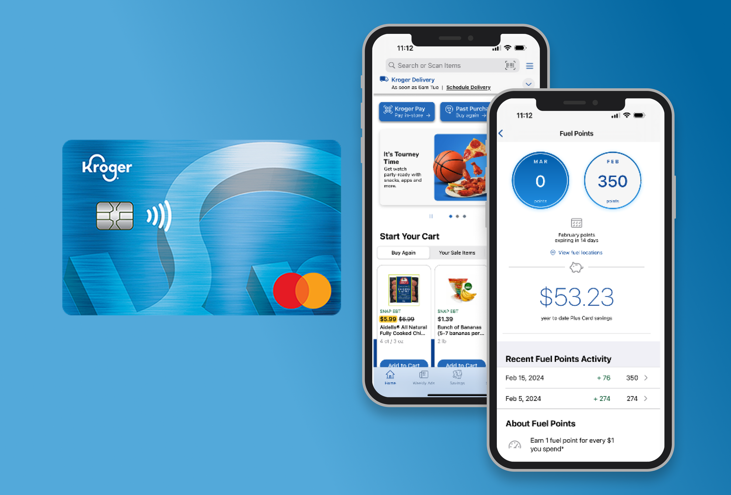
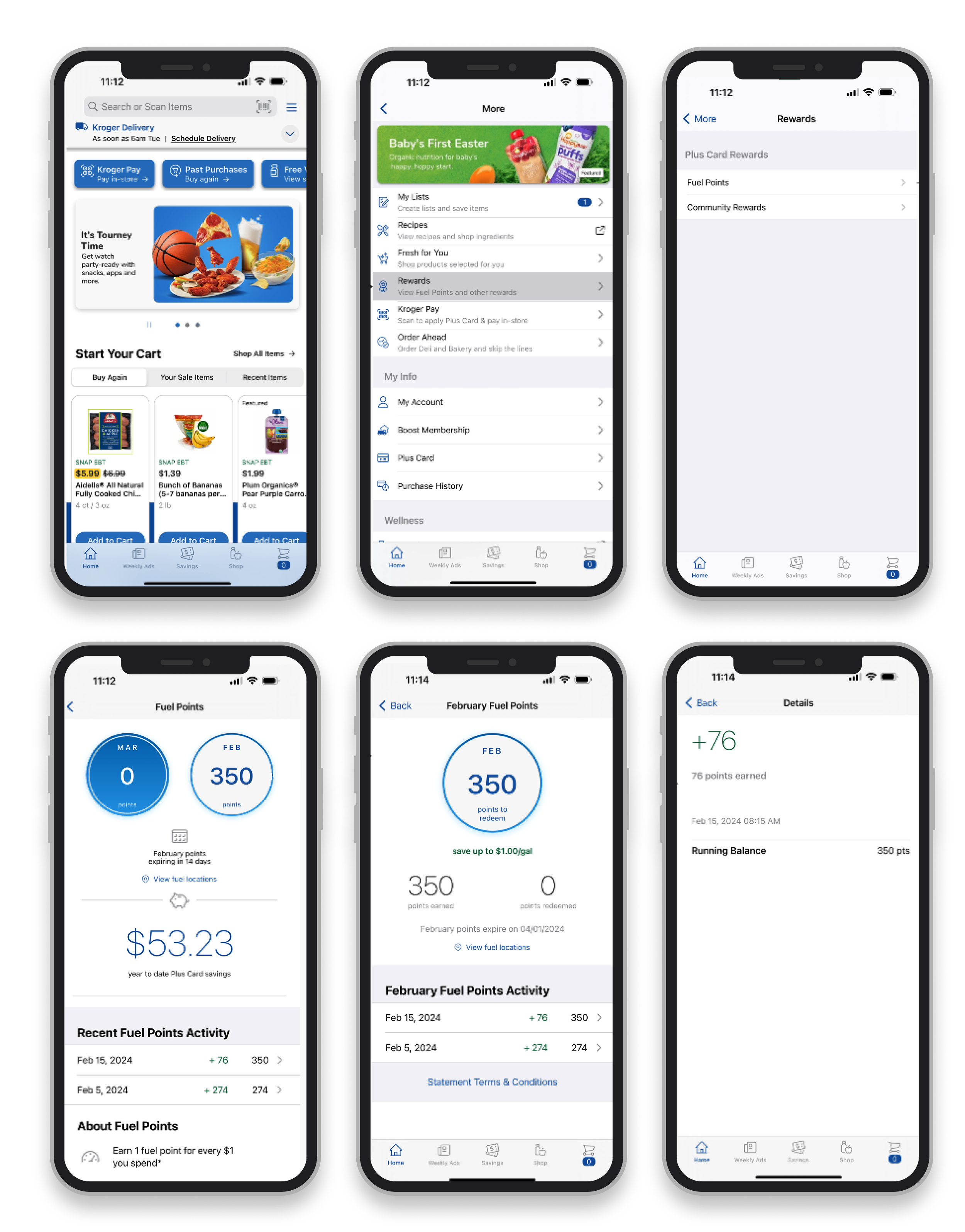
Kroger Plus is Kroger’s well-liked loyalty point system, which is redeemable as a discount at participating gas stations.
Since the credit product needs better recognition and visibility, we decided to integrate the credit card product with the existing loyalty point system.

Defining the Future State

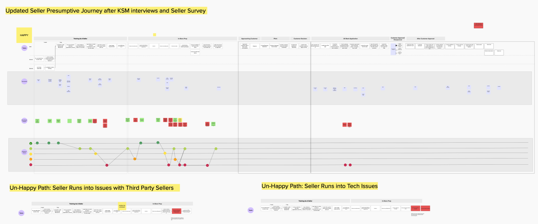


We created several artifacts when determining our future vision.
Ideal future customer journey map
Ideal future service blueprint
Customer persona
User flow of the future state app
We based these decisions on customer interviews, expert SME interviews, usability reviews, and competitive research.
Service Blueprint
Users & Personas
Credit customer persona
Ideal Future State Customer Journey
Ideal future state customer journey
Researching Back-End Integration
Kroger Credit was powered by US Bank; if the future of Kroger Credit was to integrate with Kroger Plus, we needed to do some serious technical research into how those two systems would speak to each other.
First, we spoke with the Engineering team on Kroger Loyalty to figure out how special status could be applied to Credit customers within the loyalty system, and created this diagram as a part of our conversation:
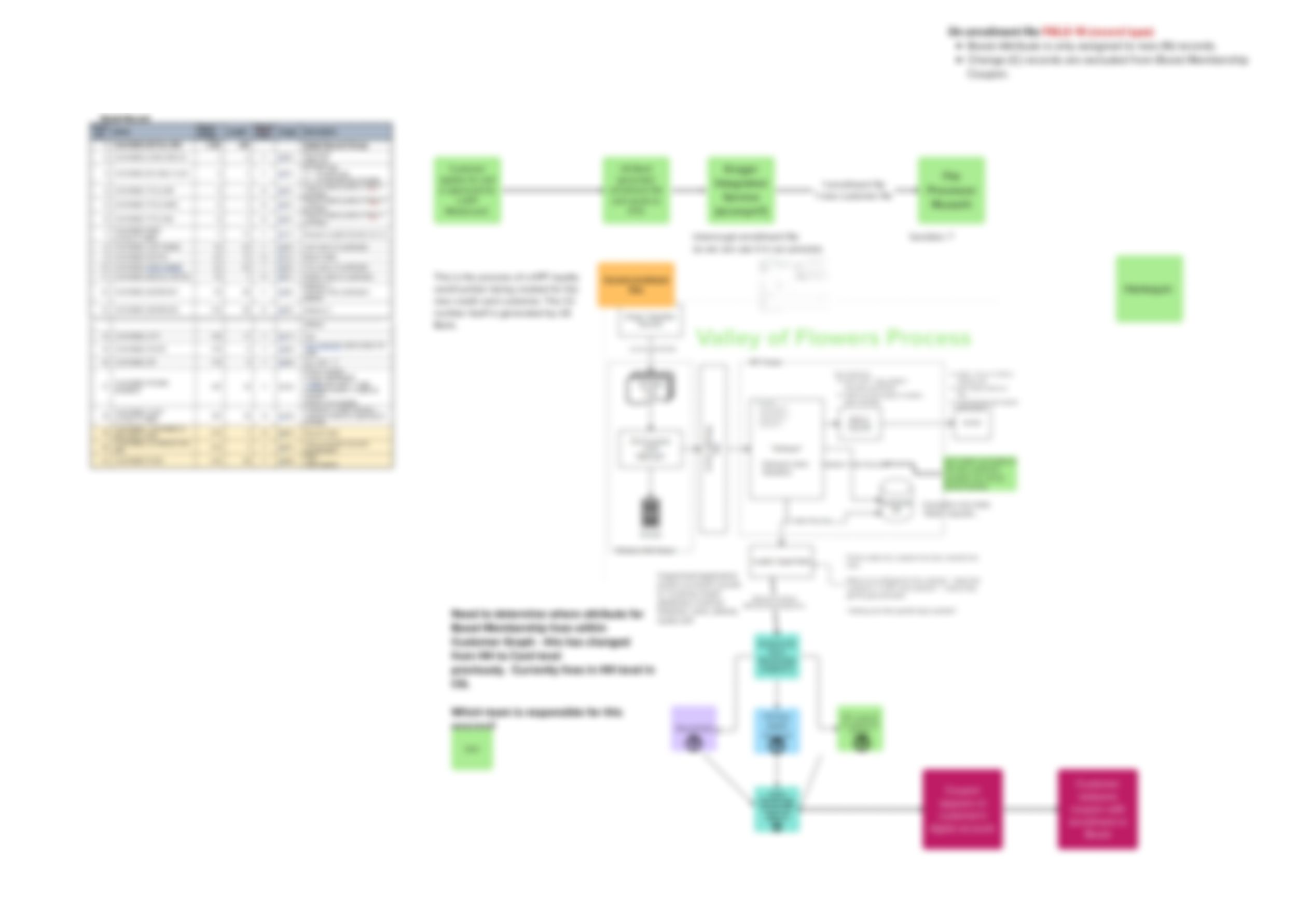
Contents blurred due to company requirements.
Our Focus
Create a modern, trustworthy system that integrates the well-known Kroger loyalty points with the Kroger credit card.
Low-Fidelity Wireframes
Before creating a full high-fidelity prototype, we created and tinkered with several rounds of low-fidelity wireframes to get the experience just right.
We focused on connecting the regular loyalty points (from purchases with loyalty card) and credit-exclusive points/offers, while keeping them distinct from each other.
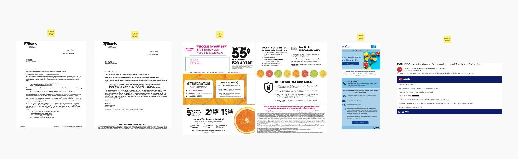
We modeled our flow after the US Bank mobile app (which powers the Kroger Credit card) in order to ground the experience in a familiar and trustworthy flow.
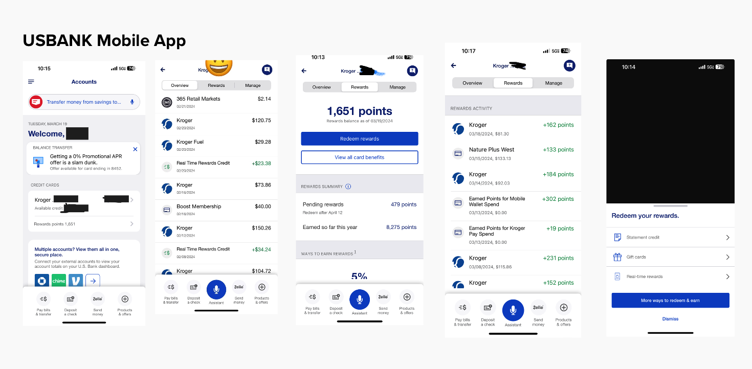
A flow from US Bank Mobile app - we modeled our Kroger Credit’s mobile experience off of this experience.
The Final Pitch
Impact & Outcomes
Here’s how we made progress toward company goals during this project:
$100M projected 10-year ROI, estimated by the business team
10% revenue growth during the time I was on the Credit team
110+ touch points were identified within our Credit future planning.
At the end of this effort, we made the following progress towards our goals:
We pitched this future version of the Kroger product to executive-level decision-makers, and our proposal was met with enthusiasm.
We laid the groundwork for a modernized, human-centered experience that will win customer trust and delight.
We started moving towards a more cohesive user strategy across the entire credit card experience, starting from when a customer first learns about the credit product.
Filled the gap in our current understanding of the credit experience (most of these had no documentation at all!), allowing for future efforts to be more streamlined and informed.