Tracking congregation trends in small and mid-sized faith organizations
Blackbaud | 2021 | UI, Research, Testing
Overview
I led user research and feature development for the Small Groups team of Blackbaud’s Church Management software, focusing on the everyday tasks of a small group. The work led to digitization and high-level data view of small group activity, contributing to a smoother user experience overall.
Role
Product Designer, Researcher
RESPONSIBILITIES
End-to-end design, research planning and execution, developer handoff, testing.
Collaborators
PM, Dev team (8+), Scrum Master
The Challenge
Small group attendance rates are the vital signs of a church — see attendance going down, and you know the church is in trouble. The problem is, much of the administration is done manually: keeping a manual excel file of members, tracking contributions, and tracking attendance. Having to analyze data manually leads to delays in reacting to lower attendance, when quick action is necessary.
The Goal
Enable church administrators to identify attendance trends in the congregation quickly, so that they can address any issues in a timely manner.
Understanding the Current State
Screenshot from a video call contextual inquiry with a client, where they walked us through how they currently track their membership numbers.
Main Users
Church admin staff & clergy
Admin volunteers
Current Flows
The PM and I conducted user interviews and contextual inquiry with church staff and clergy on how they currently manage attendance trends and gift trends.
Insights
Much of attendance and gift tracking is done manually, with manual entry excel sheets or paper printouts
If there is existing software, they use several that do not communicate with each other; staff must manually import data.
An example of membership tracking; the individual members are listed, with the type of member marked with an “X.” This is manually filled out by church staff.
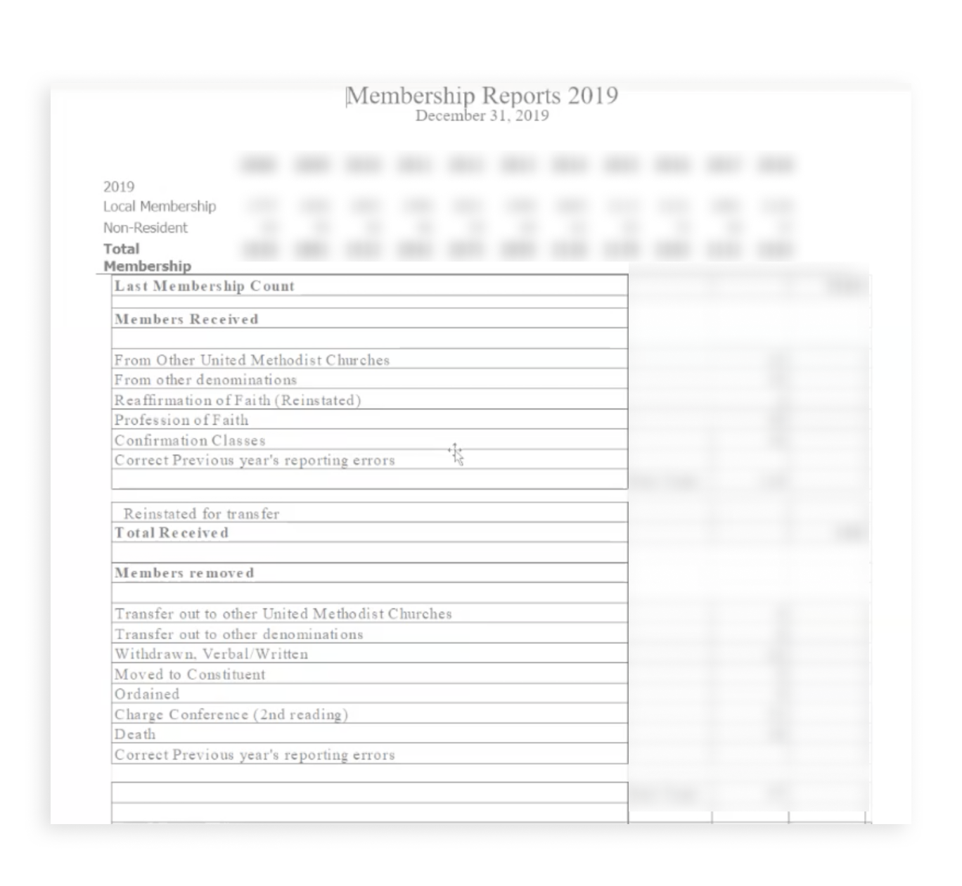
Another example of membership tracking, this time by category rather than individual members.
An example of attendance tracking; done manually with a staff member updating this spreadsheet after every service.
An example of graphs manually created to display children’s ministry attendance rates.
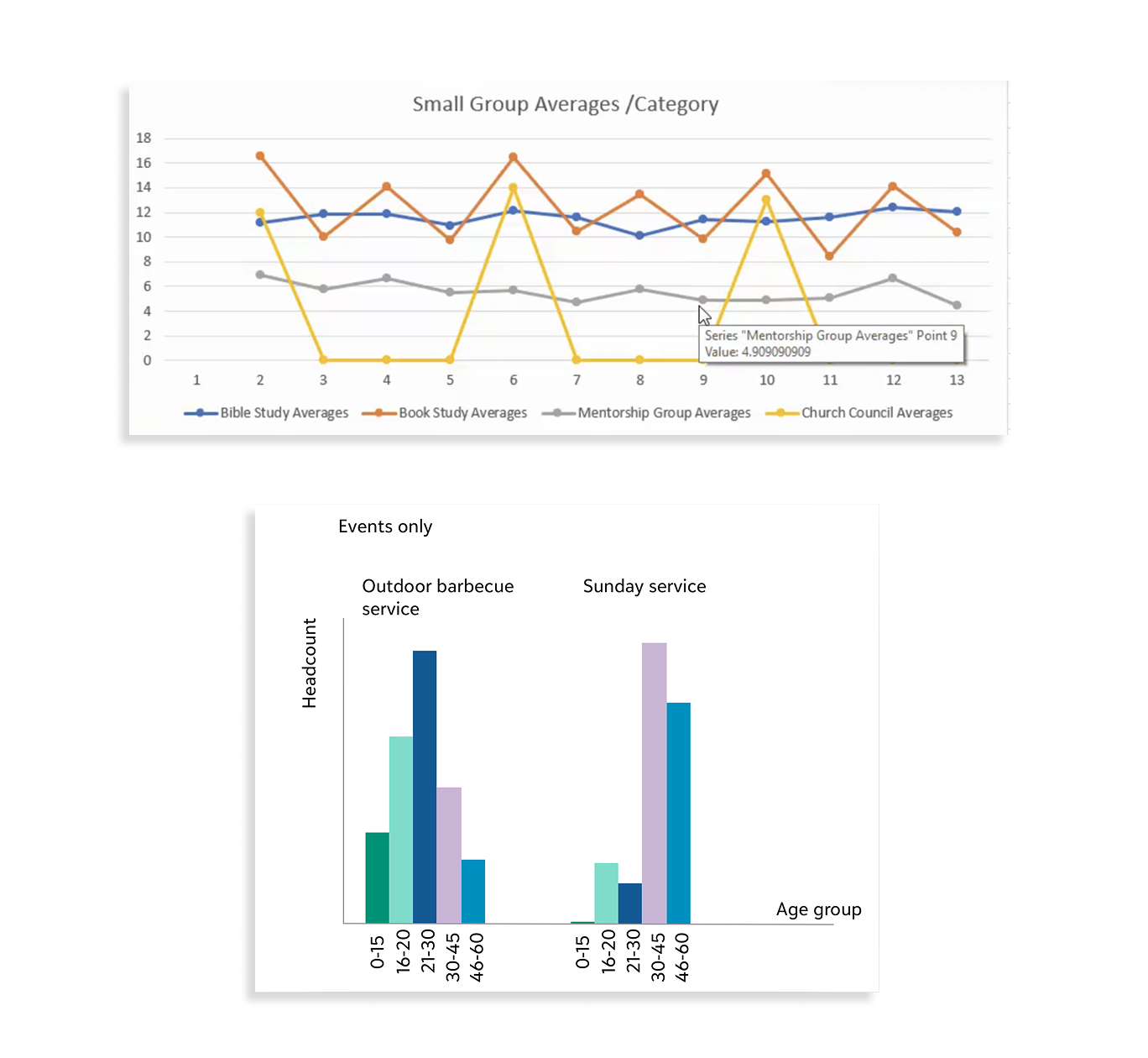
Another example of manual graphs created by ministries to keep track of attendance.
Design Workshop & Design Principles
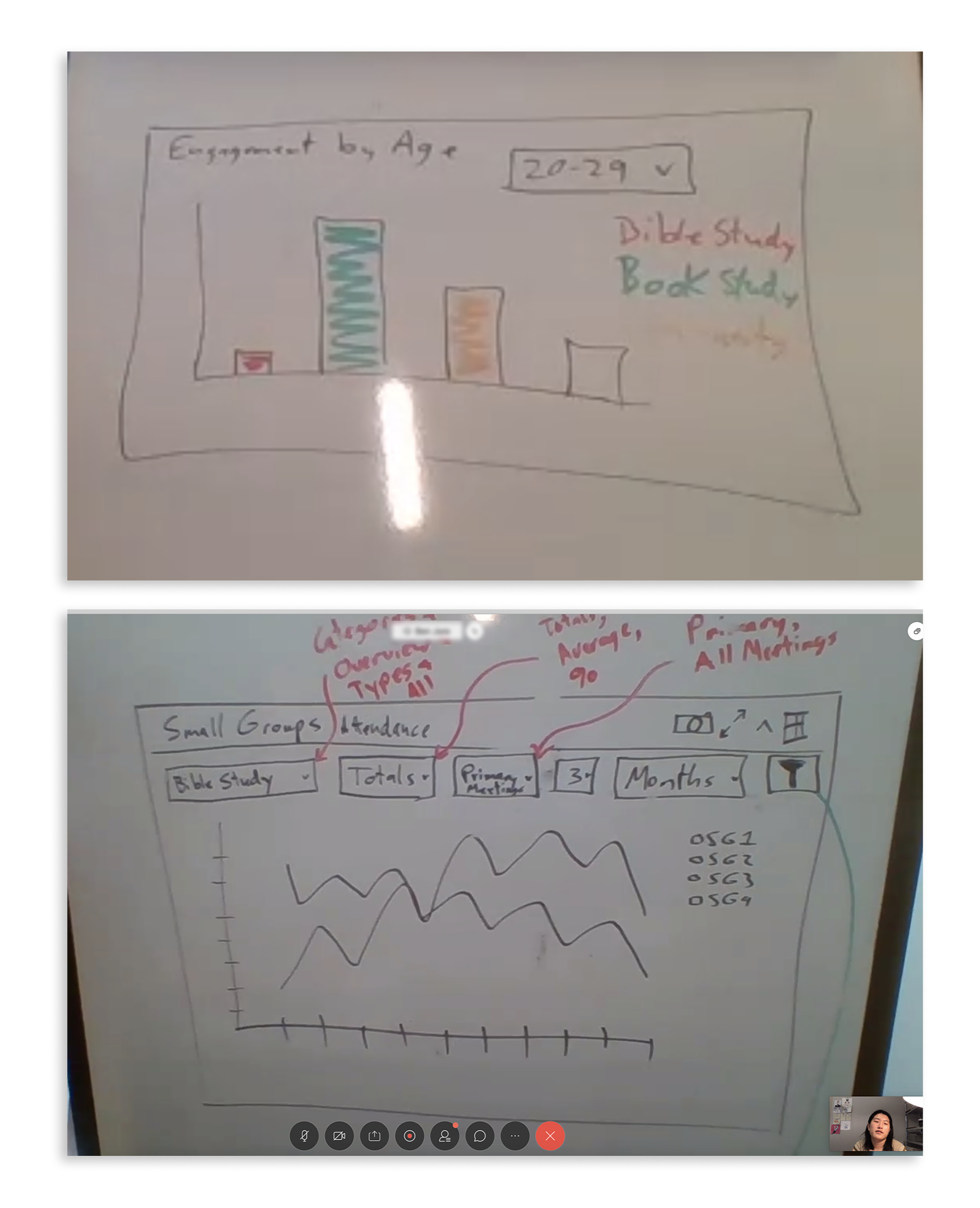
Images from design workshop; we co-design with the clients on what the data visualization may look like.
We conducted several design workshops with the clients in order to bring them into the design process and get clear on what they need from the product.
We distilled the insights from research and workshops into several design principles, which are easier to keep in mind as we work on the final product.
Design Principles
One Dash to See Them All - a single place that church administrators can see all relevant data without extra work.
Real-Time Trends: Clients need to be able to detect real-time trends so that they can make timely adjustments to their congregation strategy.
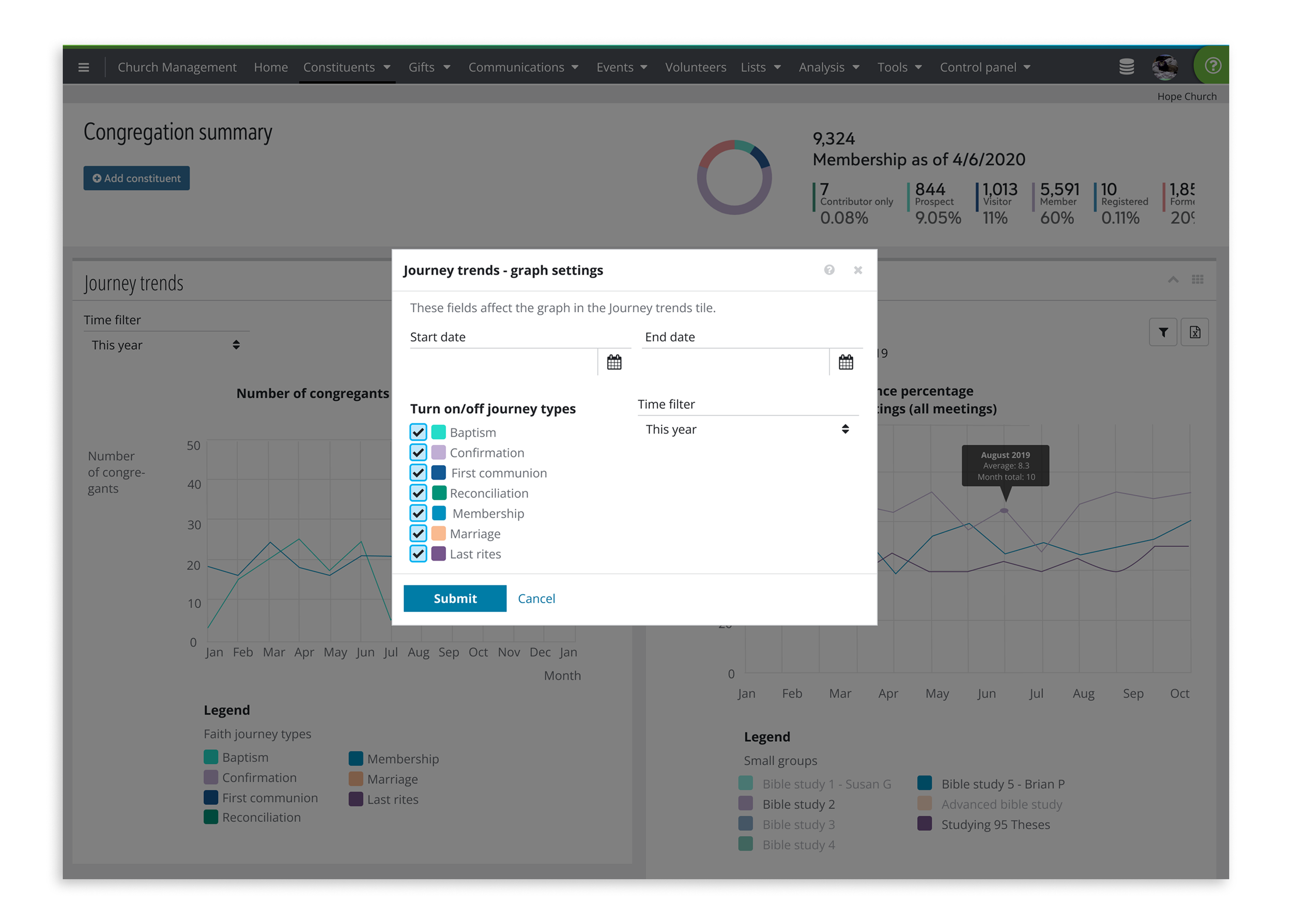
Flexibility: different churches need to be able to adjust the data & visualization to suit their unique needs.
Paper-friendly exporting: Although we will digitize a part of their process, it’s unlikely that the clients will completely move away from using paper as a part of their process; therefore, easy exporting with only the necessary information will be key.
Product Design
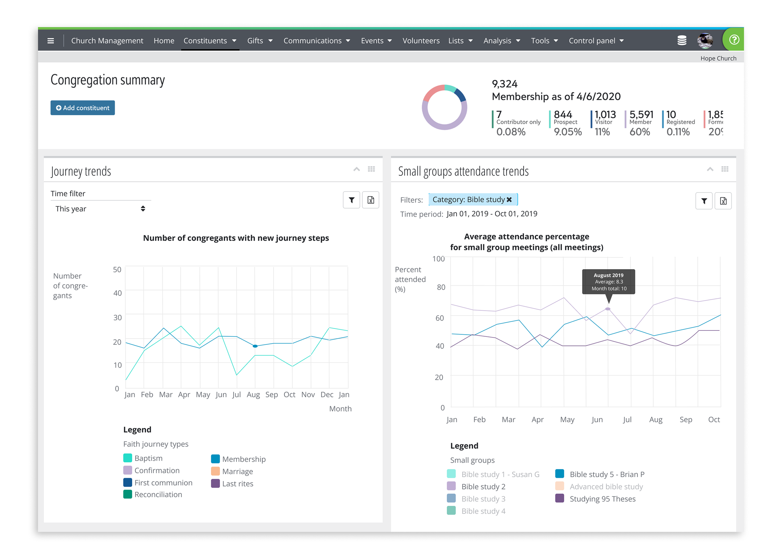
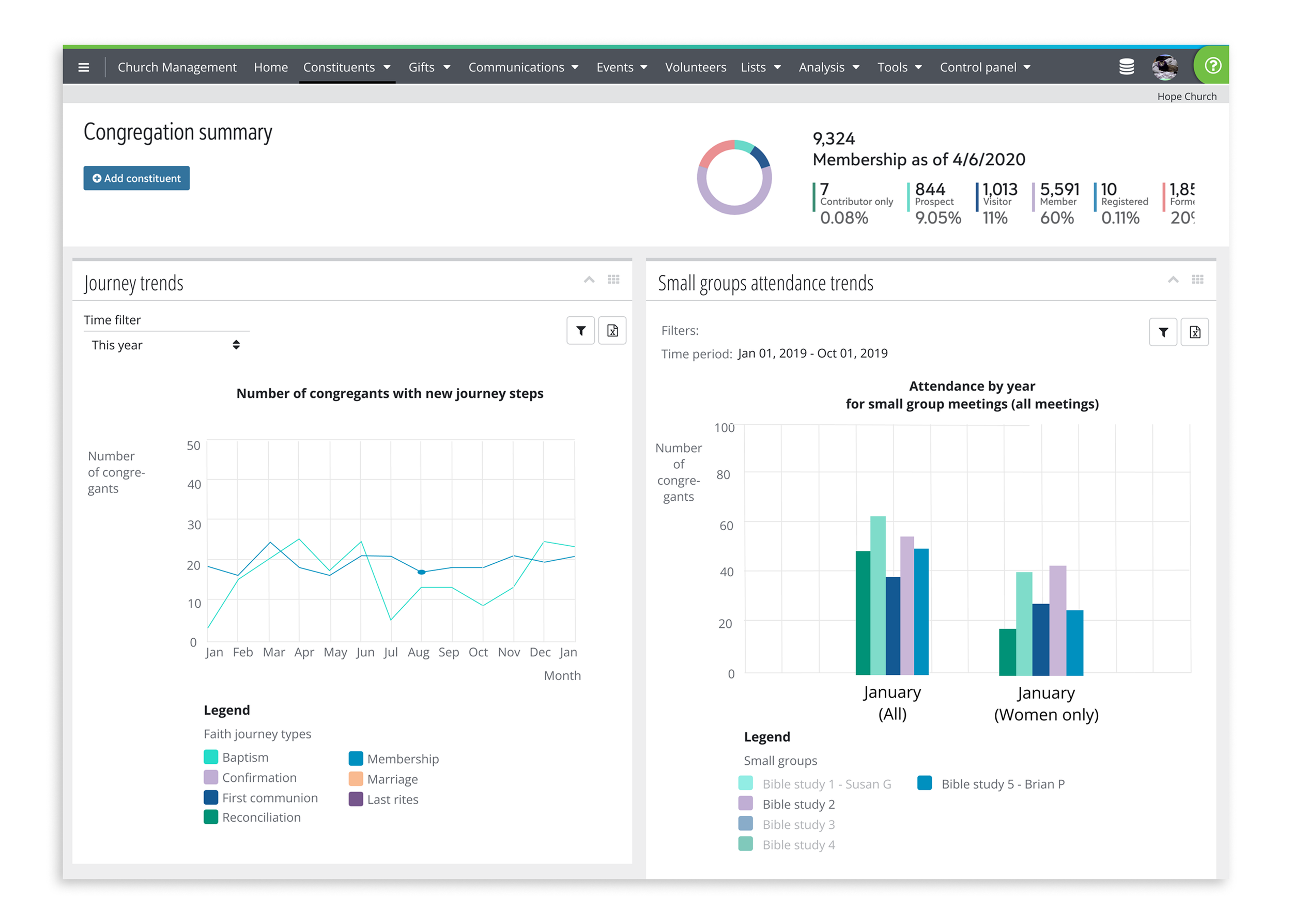
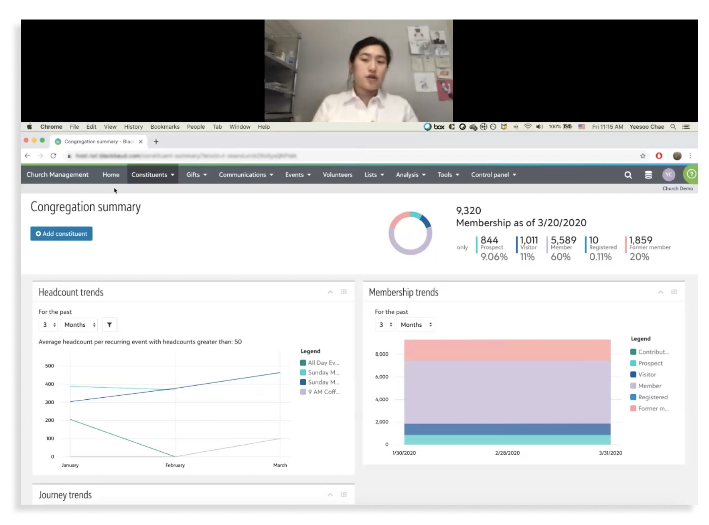
Collaborating with my PM partner, I created basic screens and structure of the Congregation Summary dashboard — a collection of most relevant data points over common periods of time. I focused on easy visualizations and sorting data into meaningful categories that makes the most sense for our clients.
Mid-Fi Wireframe of Congregation Summary dashboard.
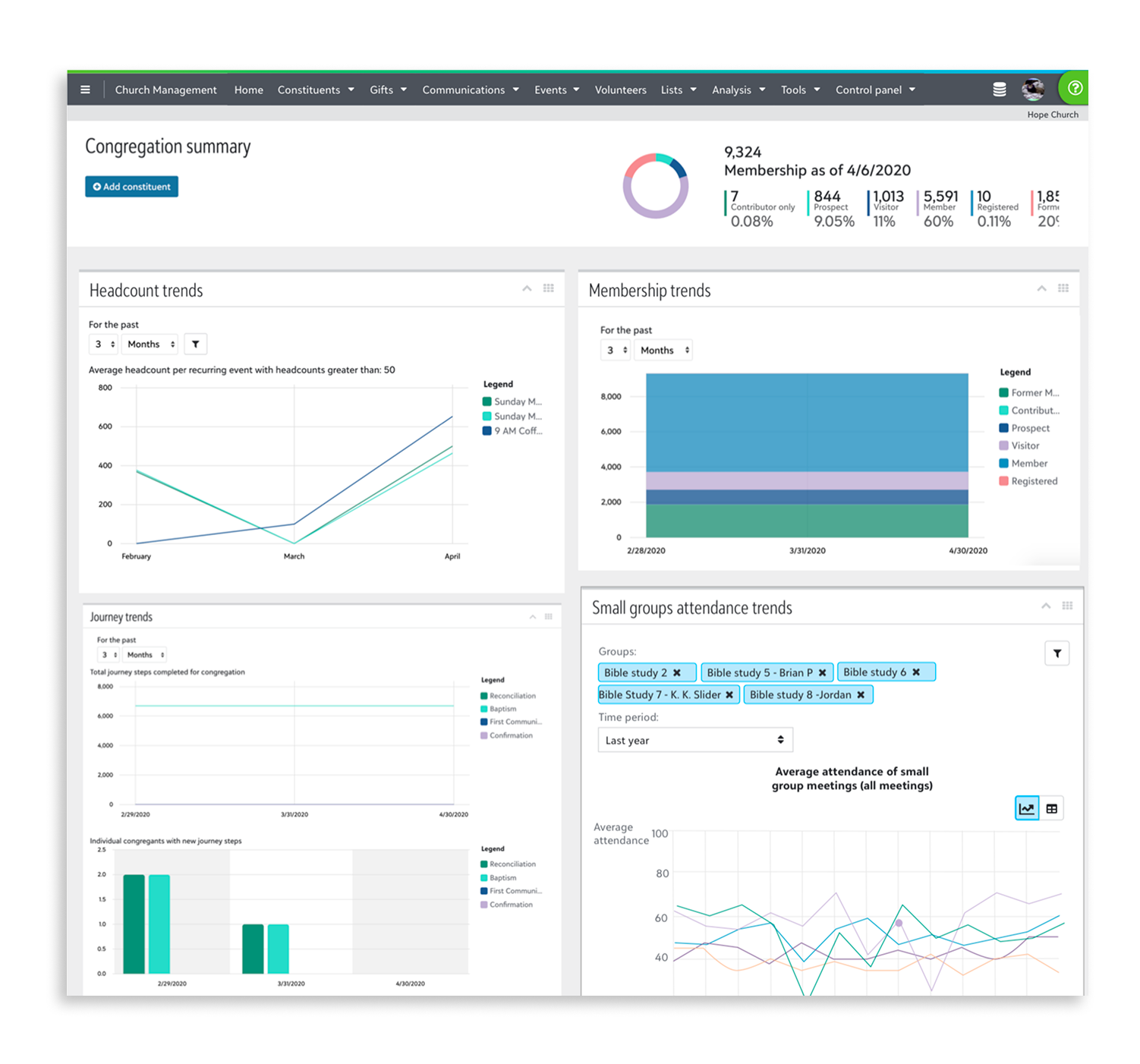
Initial Hi-Fi Mockup of the Congregation Summary dashboard.
Testing & Client Feedback
Once we had a prototype of an MVP, we got to testing. I created a click-through prototype, and asked our clients to walk through it while speaking their thoughts.
The clients appreciated the all-in-one dashboard, and easy ways to visualize the data.
They also indicated a few adjustments to the existing workflow:
More intuitive sorting capabilities
Integration with existing workflows
Ability to zero into each data point while maintaining high-level view
Design Changes
Here’s how we made those changes requested by the clients.
More Intuitive Sorting Capability
Sorting by time: Clients expressed a need for a simpler method to sort by time, such as “last month,” “last year,” or “year to date,” which are more consistent with existing reporting structures or ways of thinking.
Sorting by group type: In order to surface actionable data, clients need to sort by member type, and other qualitative categories.
Integration with Existing workflows
Export to excel with only relevant data: To better communicate with users who may not have access to
Print-from-dashboard function: Though we are helping our clients digitize, it’s unlikely that they will abandon paper trails - especially as they are a key way to archive church records. Therefore, a printing capability was directly requested by several clients.
zeroing in on each datapoint
Hover-over for individual data points: In order to confirm the trends they are seeing, clients need to be able to hover-view over individual data points, even as they are in the high-level view for their congregation trends.
Final Design
I collaborated with the team’s front-end developers to create and launch the final design; following the thread of the design principles, I focused on clarity of use and relevant sorting methods, as well as an easy export-to-excel route.