Lucidchart
CONTEXT
Graduate coursework
TIMELINE
2 week
SPONSORED BY
Lucidchart
TEAM
Brandon Williams
Quentin Magnett
Mengyi Liu
MY CONTRIBUTION
Qualitative data analysis
User journey mapping
User interviews
Solution design

Graduate coursework
2 week
Lucidchart
Brandon Williams
Quentin Magnett
Mengyi Liu
Qualitative data analysis
User journey mapping
User interviews
Solution design
Create a more fluid Template Picker experience for the cloud-based diagramming software, Lucidchart!
Heavily back up our solution with data.
Lucidchart had a problem. They are a freemium service, but their subscription rate was not improving as it should.
They realized that one of their main problems was the landing page, Template Picker, where the user could preview chart templates.
We're tasked with improving this Template Picker page.
Currently, in order to view a chart, you must click into the thumbnail and create a new file.

(Current interface)

(Current interface)
As these charts are quite complicated, the Template Picker must retain the information while being easy to interact with.
We based our personas based on information given by Lucid.

There are two types of users, "Inspire Me" and "I Know What I'm Doing."
"Inspire Me" users need more guidance during the Template Picker phrase of the onboarding, so we decided to focus on them as our main user group.
In order to find out exactly what part of the template picker was frustrating, we walked through a new "Inspire Me" user in order to find the pain points.
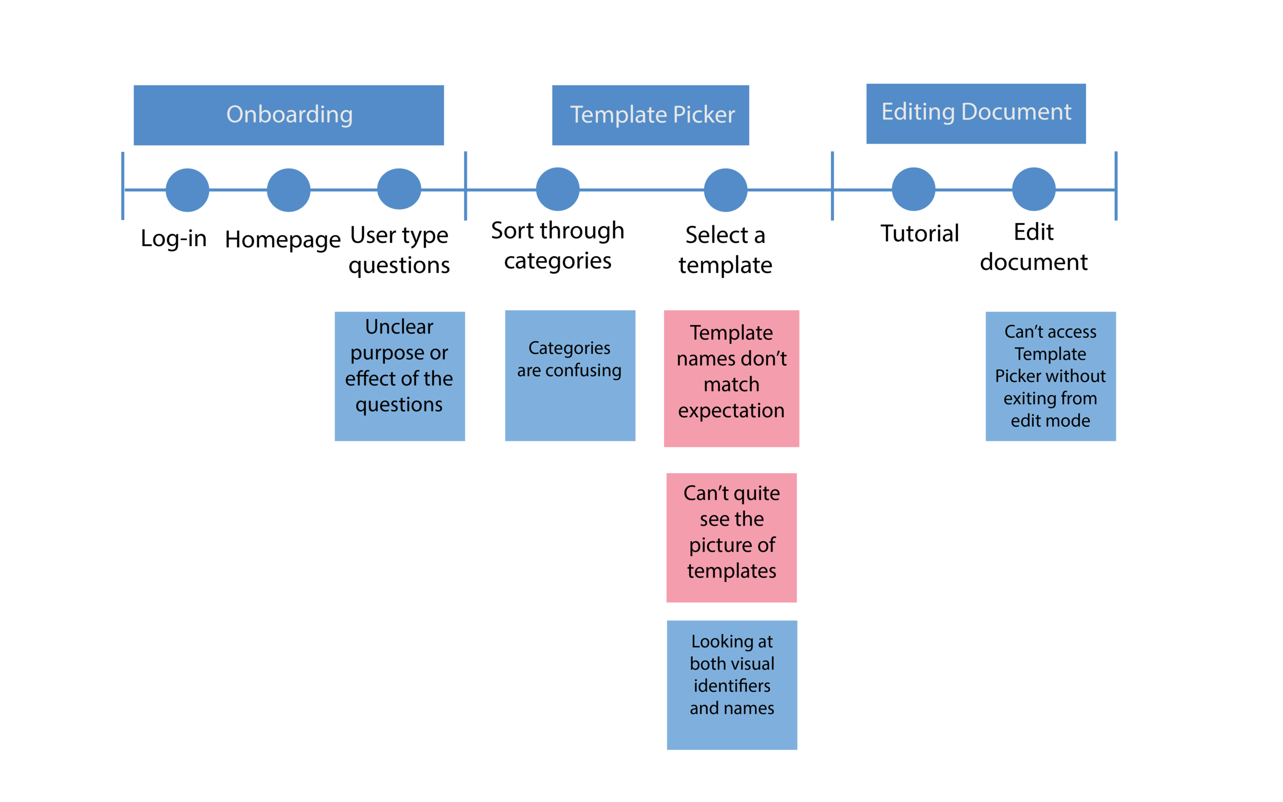
The two most significant paint points were:
“I don’t know what the template is until I click into it. That’s very frustrating. ”
A “Inspire Me” user had trouble visually recognizing the templates she needed, or by name.
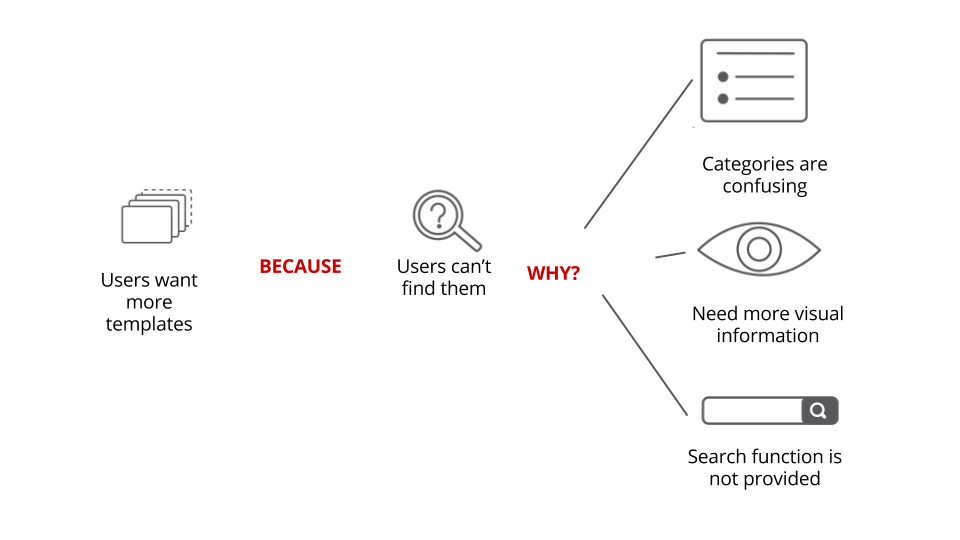
From the research, we concluded that "Inspire Me" users couldn't find the templates because of these three reasons:

1.Magnifying glass
A circular “magnifying glass” is overlaid over preview template images.
2. Side-split screen preview
The side of the template picker is portioned off as a “preview” portion, with an image of the template and descriptions.
3.Examples
Users can scroll through images of how the templates were customized by other customers, or by Lucid.
4.Video/GIF preview
If user hovers over template image, they can see a brief video of the template in use.
5.Use Case Recommendations
Different uses of a single template are recommended.
6.Template recommendations
Template Picker also recommends some similar templates.

When hovering over a thumbnail

Preview is responsive to movement within thumbnail
Our solution was to create a hover-preview that would interact with the movement of the cursor.
We wanted our final solution to be lightweight and require few engineering hours but still an effective solution.
Since we had only one solution, we received some critiques that we should have come up with more variations of
It's easy to think it's best to be flashy, but the most effective solutions are often the simplest ones.
It's easy to get lost in the process. Before each major decision, we would trace back our thought process from the beginning, and it would help us contextualize a decision. We believe this is the