MyChart.com Redesign
UX Designer, 10-week in-house project at Epic Systems summer internship.


Timeline & Deliverable
10 weeks, team of two
Fully functioning digital prototype
UX Research Skills
Experience Mapping
Goal-Signal-Metrics mapping
Moodboards
Interviews
My role
Project Management
UX/ Experience Design
Visual Design
I collaborated with an engineer and we made choices together about the prototype.
I was the only UX Designer on the project, and I made independent decisions on research and what features to implement. I did all of the field work, experience design, and visual design myself.
The engineer was mainly responsible for creating & implementing the map API included in the design. The choices about the map / catalog page was mainly determined by him and limitations of the map API.
Stakeholders
Main product manager for MyChart (weekly check-ins about direction)
Mentor (designer, connected me with resources & people, ok’d projects)
Developers (one back-end, one front-end manager, plus my partner developer)
Design Team Lead (weekly check-ins)
“The Kayak of MyCharts”
Problem Space
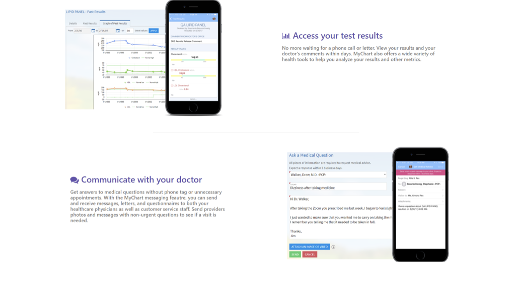
The Product Manager of MyChart came to me with a problem: the current MyChart website is too plain, simply a landing page that redirects to a download for the phone application.
MyChart is Epic’s patient portal, and its most recognizable face by patients. However, the website for it is only a landing page directing patients to download the app on their phone-- how can we provide the same functionality as the current version, but also include MyChart as part of the Epic network of applications?

The current MyChart.com. You can download the phone app here, but it doesn’t have any other pages.
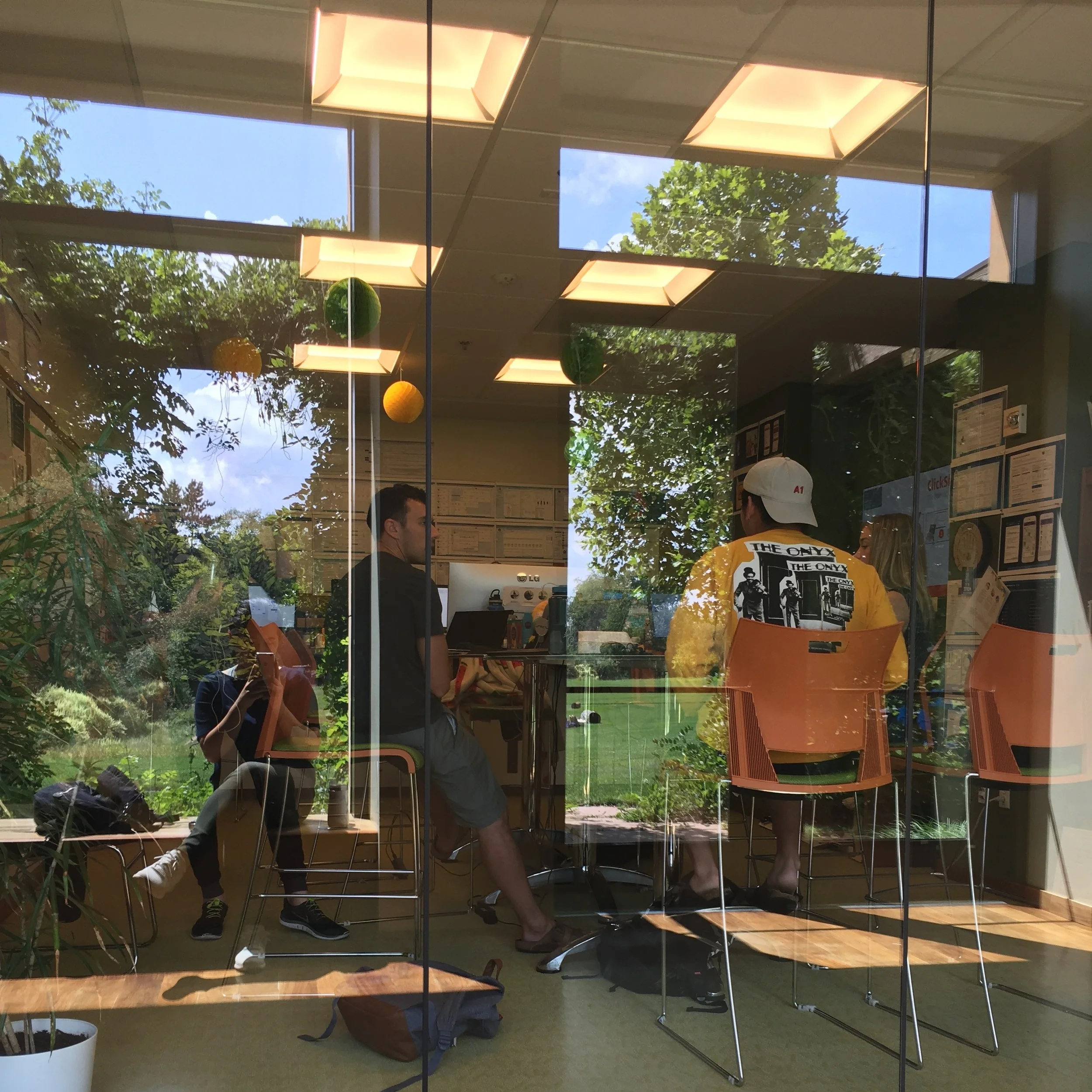
The design team in the studio, hard at work.
After consulting with the product manager and some of the other designers who work within MyChart, I drafted a list of goals for the new MyChart.com. These served as success metrics as well. These were based on the comments I’d received from the team that was working on MyChart, and what the identity of MyChart was like.
MyChart is the face of Epic software for patients, although they don’t necessarily realize it
It’d be useful to have some Epic brand identity be stronger, since each hospital uses their own “wrapping” for their MyCharts
We cannot create competition between the hospitals/clinics that we serve
Success Metrics
The things that would make this project a success would be:
Increased patient engagement with hospitals/clinics that use MyChart
Increased and consistent level of hospitals/clinics opting into enabling MyChart in their services
A PATIENT EXPERIENCE OUT OF THIS WORLD
Visual & Experience Inspiration
deciding the visual theme

Space!
This was a conceptual, future-facing project, so I could have some fun with the visual theming of the new website. Epic employs a lot of space imagery within the campus (and some on its website, as shown above), so I knew I wanted to play with some space imagery in the redesign.


Research
I designed and conducted several guerilla research sessions to narrow down functions that the website should serve.
Google search & intention mapping
To decide what features to include in the redesign, I mapped most likely Google searches and what a visitor would expect, so that I could reverse-engineer these needs and incorporate them into the new website.
Interviews

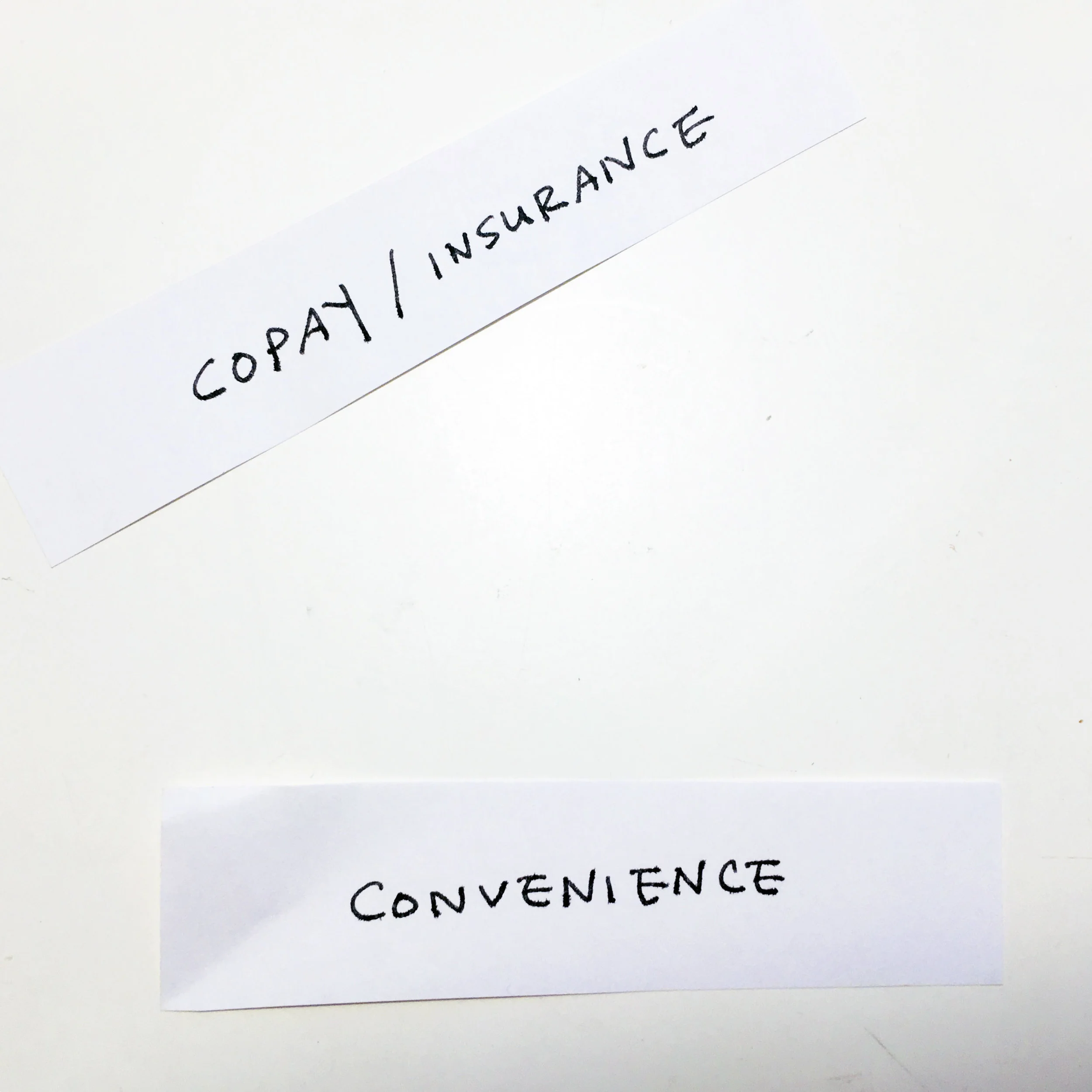
I interviewed several Epic employees to identify what they value the most when looking for a new doctor. Upon Cardsorting & interviews, it became clear that what people want out of a doctor portal is to be able to find a doctor that’s closest who will also accept their insurance.
“The two most important things to me are what the copay is, and how convenient it is for me to get there. ”
Cardsorting
Participants were asked to look at a list of 8 cards with various factors, such as distance, copay, gender, race, and rank which factors they take into account when they search for a new doctor.

Competitor Review
We looked at various related & competitor websites to observe some common threads in how information was organized.
Key Insights
The new website needs to serve these needs:
Current Use:
Download phone apps
Online presence: “we exist!”
Uses wanted by the team:
introductory information about mychart
New branding
How to find new doctors that use MyChart “kayak”
Being able to sort by different MyChart features
Other uses (competitive research):
Playfulness of interaction
Sorting by insurance & distance
Sketches
Throughout the whole process, I organized my thoughts through sketching and visual note-taking.
Map out the patient’s thought process. I mapped Google searches with expected results & hopes.
2. Rough Wireframes: Based on the Google search mapping, I created several wireframes for how the page should look in order to match the patient’s needs.
3. introducing the space theme
After determining function, I studied ways to tie the visual theme of the redesign to some of the existing Epic space imagery.
Redesign Mockups & Rationale
Home page
Clear call-to-action for the most frequent use case: looking for new providers.
More organized branding and credentials.
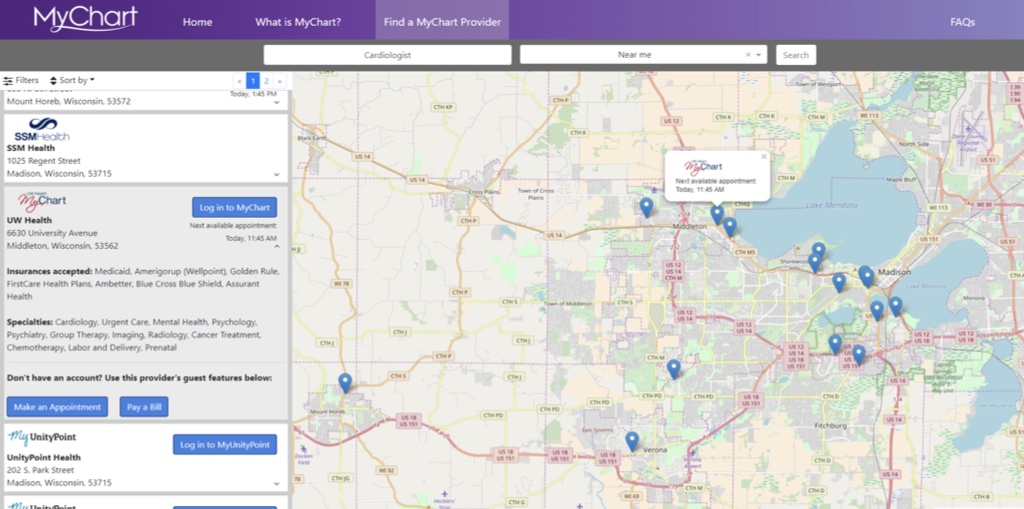
“Search for Providers” page
Playful zero state with space imagery
Accommodation for several different ways of searching for providers: by organization, procedure, or specialty.
Search results
Link to the individual MyCharts to serve users who already have a provider, but are looking for the MyChart links.
At this stage, users are able to sort by insurance and distance.
An example of an institution’s MyChart page. If the user clikced “Log into MyChart” from the previous screen, they would be taken here.
FAQ Page
Clearer branding with an overview of MyChart’s features